
Hi everyone Alan here! Let me explain a long story short. Joey got homework, ask me to fill in for him, so we made a deal, the end! So that means I'm doing today's post while Joey takes care of this Saturday post, so hopefully no ain't too heartbroken (or too ticked off) let's get to some concept shall we.
Team Latvia Concept [Jake88]
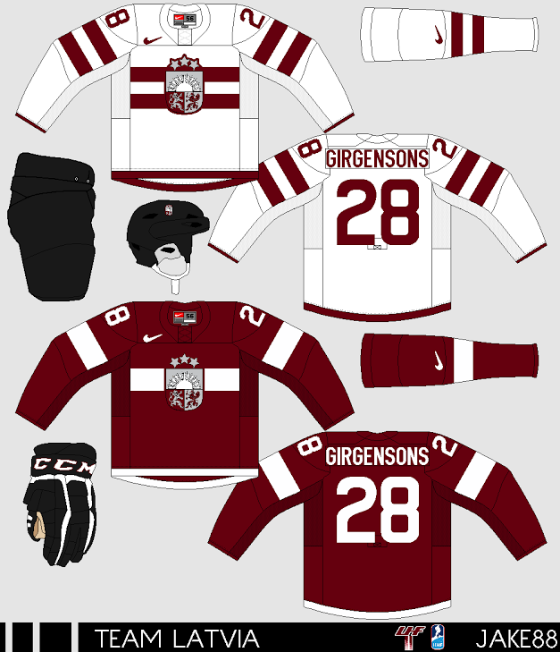 Up points: The main logo on the front of the jersey fits the team very well. On the white it has two maroon stripes on just both the arms, the socks, and the chest it's good and not over the top. The colored one only got one stripe, but look classy to my cup of tea. Lastly good choice of fonts on both nameplate, and numbers.
Down points: Those stupid fake collars, I hate them. The equipments are all black, the only maroon colors I see is the trim around the "CCM" logo, and the shield logo on the helmet, it just doesn't fit well with the concept to me.
My Suggestion: Add at least some more maroon color to the equipments to fit with the jerseys.
Well that's Wednesday post for you all, be here tomorrow for your regular writers post until this Saturday as Joey will post one for me. Lastly I got a video from the good old YouTube! It's a Buffalo Sabre player receiving a wrong helmet! Until then, later.
Team Latvia Concept [Jake88]
Down points: Those stupid fake collars, I hate them. The equipments are all black, the only maroon colors I see is the trim around the "CCM" logo, and the shield logo on the helmet, it just doesn't fit well with the concept to me.
My Suggestion: Add at least some more maroon color to the equipments to fit with the jerseys.
Well that's Wednesday post for you all, be here tomorrow for your regular writers post until this Saturday as Joey will post one for me. Lastly I got a video from the good old YouTube! It's a Buffalo Sabre player receiving a wrong helmet! Until then, later.
No comments:
Post a Comment
HCI is a site where concept artists send in their concepts to get constructive criticism. Any comment that is profane, mean spirited, racist, or has nothing to do with hockey concepts will be removed.